BLOCK REFERENCE / UI
UI
Text, buttons, images, bars, dialogues, menus and fonts.
17 blocks
#Choice menu

Shows a keyboard menu over your UI texts, pauses the script until the player picks one and stores its number.
Arrow keys or WASD move the selection (with several columns, up/down move one row). Confirm stores 1, 2, 3...; a cancel key stores 0. The options stay visible afterwards, so hide them with Hide UI if needed. While open, Dialogue or menu is open is true and Walk on grid pauses. A missing option object stops the game with an error.
| Field | What it means |
|---|---|
option UI textstext | Names of the UI objects that act as options, separated by commas, in order.Default: Option1, Option2 |
labels a|b {…}text | Optional texts for the options, separated by | (for example Fight|Run). Accepts {templates}. Empty keeps the current texts. |
answer intotext | Variable that receives the answer: choice (this object), Player.choice (another object) or global.choice.Default: choice |
cursor UItext | Optional UI or object placed 8 pixels to the left of the selected option, vertically centred. |
columnsnumber | Number of columns in the grid of options (1 to 12). Left/right only work with more than one column.Default: 1 |
start atnumber | Option selected when the menu opens, starting at 1.Default: 1 |
confirm keystext | Keys that confirm, separated by spaces (for example z enter space).Default: z enter space |
cancel keystext | Keys that cancel and store 0. Empty means the menu cannot be cancelled. |
selected colourtext | Text colour of the selected option, as #RRGGBB. Only applies to UI Text options.Default: #ffe28a |
normal colourtext | Text colour of the other options, as #RRGGBB.Default: #f3ead7 |
move sounddropdown | Optional sound played when the selection moves. |
confirm sounddropdown | Optional sound played when the player confirms or cancels. |
Example After a Say in dialogue box, offer Yes|No and branch on choice with an If.
#Disable Button
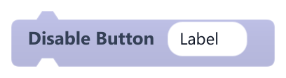
Disables a UI Button so it ignores hover and clicks and shows its disabled look.
A disabled button uses its disabled colour or image and never fires When This Button Clicked. If the object is missing or of the wrong kind, a message is printed to the console and the game continues.
| Field | What it means |
|---|---|
UItext | Name of the UI Button (not case-sensitive).Default: Label |
Example Disable a Buy button while the player cannot afford the item.
#Enable Button
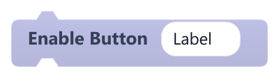
Enables a UI Button again so it reacts to hover and clicks.
If the object is missing or of the wrong kind, a message is printed to the console and the game continues.
| Field | What it means |
|---|---|
UItext | Name of the UI Button (not case-sensitive).Default: Label |
#Hide UI
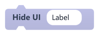
Hides a UI object (text, image or button).
Only works on UI objects. A hidden UI Button can still be clicked where it was, so also use Disable Button if it must stop reacting. If the object is missing or of the wrong kind, a message is printed to the console and the game continues.
| Field | What it means |
|---|---|
UItext | Name of the UI object to change (not case-sensitive).Default: Label |
Example Hide a Paused label when the game resumes.
#Say in dialogue box

Types text letter by letter into a UI text, then pauses the script until the player presses a key.
Pressing a key while it types shows the whole line; the next press closes it. Write \n for a line break. While open, Dialogue or menu is open is true and Walk on grid pauses; other controls such as Platformer controls keep running. A missing UI object stops the game with an error, so clear box UI if you have no box.
| Field | What it means |
|---|---|
text {…}text | The line to show. Accepts {templates} such as {Player.name} or {global.gold}.Default: Hello, traveller! |
speaker {…}text | Name written into name UI. Accepts {templates}. |
text UItext | UI Text that receives the typed text. Required.Default: DialogueText |
box UItext | Optional background object shown while the dialogue is open.Default: DialogueBox |
name UItext | Optional UI Text for the speaker's name. |
'more' UItext | Optional object shown once the line is fully typed, such as a small arrow. |
letters / secnumber | Letters per second. 0 shows the whole line at once.Default: 45 |
keys (space separated)text | Keys that skip and continue, separated by spaces.Default: z enter space |
blipdropdown | Optional blip sound played every 3 letters while typing. |
hide afterdropdown | on hides the box, text and name when the line closes; off leaves them visible, handy for several lines in a row.Options: on · off |
Example Chain several of these in a When Scene Starts script for an intro conversation, with hide after set to off except on the last one.
#Set bar

Resizes a bar to value / max of its full width, with an optional image for each fill level.
The width animates with an ease-out over seconds, keeping the left edge in place. At 0 or below the bar is hidden; above 0 it is shown. A missing bar object or a value that is not a number stops the game with an error.
| Field | What it means |
|---|---|
bartext | Name of the bar object: a UI Image or a regular sprite.Default: HPBar |
value {…}text | Current value. Accepts {templates} such as {hp} or {Player.hp}.Default: {hp} |
of {…}text | Maximum value. Accepts {templates}. 0 or less counts as an empty bar.Default: {max_hp} |
full widthnumber | Width in pixels when the bar is full.Default: 200 |
secondsnumber | Duration of the resize animation in seconds. 0 resizes instantly.Default: 0.3 |
image > 50%dropdown | Optional image used when the bar is more than 50% full. |
image > 20%dropdown | Optional image used between 20% and 50%. |
image lowdropdown | Optional image used at 20% or less. |
Example Run it after the player takes damage, with green, yellow and red images for the three levels.
#Set Button Image

Sets the image a UI Button shows in one of its states.
Images only appear when the button's background mode is set to image in the Inspector; in colour mode the change is stored but not visible. Hover, pressed and disabled fall back to the normal image when empty. If the object is missing or of the wrong kind, a message is printed to the console and the game continues.
| Field | What it means |
|---|---|
UItext | Name of the UI Button (not case-sensitive).Default: Button |
Statedropdown | Which state to change: normal, hover, pressed or disabled.Options: normal · hover · pressed · disabled |
Imagedropdown | Image from the project assets. Empty clears the image for that state. |
#Set Button Text
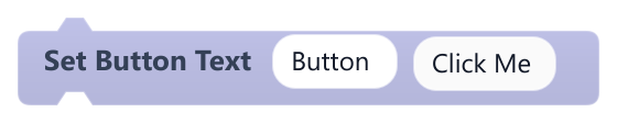
Changes the label shown on a UI Button.
Only works on UI Buttons; Set UI Text works on both texts and buttons. If the object is missing or of the wrong kind, a message is printed to the console and the game continues.
| Field | What it means |
|---|---|
UItext | Name of the UI Button (not case-sensitive).Default: Button |
Texttext | New label. A block plugged into the socket (number, text or boolean) is converted to text.Default: Click Me |
Textsocket | New label. A block plugged into the socket (number, text or boolean) is converted to text.Default: string, number, boolean, any |
Example Change a Start button to Continue once a save exists.
#Set UI Color

Changes a colour of a UI Text or UI Button.
On a UI Text it always sets the text colour and Role is ignored. On a UI Button, Role picks what to recolour. UI Images have no colour (use Set UI Opacity). If the object is missing or of the wrong kind, a message is printed to the console and the game continues.
| Field | What it means |
|---|---|
UItext | Name of the UI object to change (not case-sensitive).Default: Label |
Roledropdown | Button part to recolour: text (label), normal, hover, pressed, disabled (background per state) or tint (overlay on image buttons; only visible if the button's tint opacity is above 0).Options: text · normal · hover · pressed · disabled · tint |
Colortext | Colour as a hex code such as #ff8800. Invalid colours fall back to the default when drawn.Default: #ffffff |
Colorsocket | Colour as a hex code such as #ff8800. Invalid colours fall back to the default when drawn.Default: string, any |
Example Turn a timer label red with #ff4040 when fewer than 10 seconds remain.
#Set UI Font
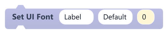
Changes the font, and optionally the size, of a UI Text or UI Button.
If the font file does not exist, a warning is logged once and the current font is kept (the size still changes). Only UI Texts and UI Buttons are accepted; other objects log a warning.
| Field | What it means |
|---|---|
UItext | Name of the UI Text or UI Button (not case-sensitive).Default: Label |
Fonttext | A project font file (.ttf or .otf) such as assets/fonts/MyFont.ttf, an installed family such as Arial, or Default to go back to the default font.Default: Default |
Size (0 = keep)number | New size in pixels, from 1 to 512. 0 keeps the current size.Default: 0 |
Example Switch a title to a pixel font when the game starts.
#Set UI Font Size

Changes the font size of a UI Text or UI Button.
Size is in pixels, rounded down to a whole number, minimum 1. The text also scales with the camera zoom. If the object is missing or of the wrong kind, a message is printed to the console and the game continues.
| Field | What it means |
|---|---|
UItext | Name of the UI object to change (not case-sensitive).Default: Label |
Sizenumber | Font size in pixels. A block plugged into the socket replaces the typed value.Default: 24 |
Sizesocket | Font size in pixels. A block plugged into the socket replaces the typed value.Default: number, any |
#Set UI Image
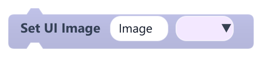
Changes the image of a UI Image, or the normal image of a UI Button.
On a button it replaces only the normal state image, which is visible only in image background mode. If the object is missing or of the wrong kind, a message is printed to the console and the game continues.
| Field | What it means |
|---|---|
UItext | Name of the UI object to change (not case-sensitive).Default: Image |
Imagedropdown | Image from the project assets. Empty leaves a UI Image blank. |
Example Swap a portrait image depending on who is talking.
#Set UI Opacity
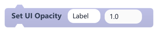
Sets how opaque a UI object is, from 0 (invisible) to 1 (solid).
Values are clamped between 0 and 1. It is visible on UI Images and UI Buttons; UI Texts currently ignore it when drawn, so use Hide UI or Set UI Color for text. If the object is missing or of the wrong kind, a message is printed to the console and the game continues.
| Field | What it means |
|---|---|
UItext | Name of the UI object to change (not case-sensitive).Default: Label |
Opacitynumber | Opacity from 0 to 1. A block plugged into the socket replaces the typed value.Default: 1 |
Opacitysocket | Opacity from 0 to 1. A block plugged into the socket replaces the typed value.Default: number, any |
Example Set 0.5 on a locked menu icon to make it look faded.
#Set UI Text
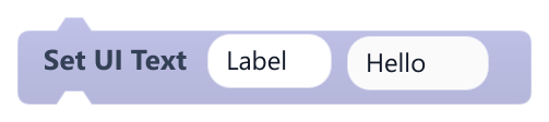
Changes the text of a UI Text or the label of a UI Button.
On a UI Text, the text is drawn from the top-left corner and wraps to the object's width. If the object is missing or of the wrong kind, a message is printed to the console and the game continues.
| Field | What it means |
|---|---|
UItext | Name of the UI object to change (not case-sensitive).Default: Label |
Texttext | New text. A block plugged into the socket (number, text or boolean) is converted to text.Default: Hello |
Textsocket | New text. A block plugged into the socket (number, text or boolean) is converted to text.Default: string, number, boolean, any |
Example Plug a variable reporter into Text inside On Update to show the score.
#Set UI text from template

Sets a UI text from a template, replacing each {reference} with the current value of a variable.
{name} reads this object's variable, {Object.name} another object's and {global.name} a global; x, y, width, height and name also work as properties. Unknown references are left as typed. Whole numbers show without decimals, others with up to 2. Does nothing if the UI object is not found.
| Field | What it means |
|---|---|
UItext | Name of the UI Text or UI Button to update.Default: Label |
texttext | Text with {references}, for example Score {score} Lives {Player.lives}.Default: Score {score} |
Example Inside On Update of a HUD object to keep Coins {global.coins} up to date.
#Set UI Value (Unsupported)

Reserved: currently has no effect at runtime.
Meant for progress bars, but not implemented yet. Use Set bar to show a value as a bar.
| Field | What it means |
|---|---|
UItext | Name of the UI object. Currently ignored.Default: ProgressBar |
Valuenumber | Value to set. Currently ignored.Default: 50 |
Valuesocket | Value to set. Currently ignored.Default: number, any |
#Show UI
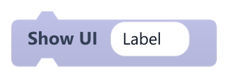
Shows a UI object (text, image or button) that was hidden.
Only works on UI objects. If the object is missing or of the wrong kind, a message is printed to the console and the game continues.
| Field | What it means |
|---|---|
UItext | Name of the UI object to change (not case-sensitive).Default: Label |
Example Show a Game Over label when the player runs out of lives.